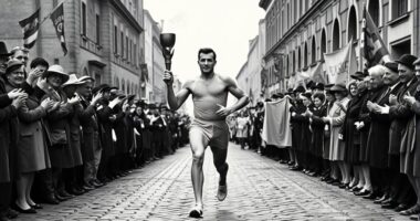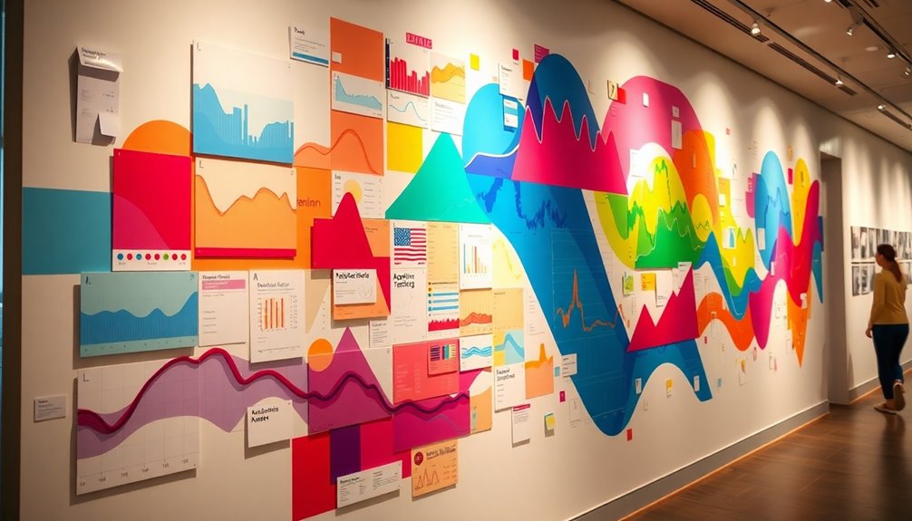

You've got to see how one runner transformed their training data into stunning wall art, catching the eyes of museums around the world. Using algorithms, they mapped out their runs, capturing the emotional highs and lows we all experience while pushing our limits. Each artwork reflects dedication, challenges, and triumphs in a vibrant way, making the numbers come alive. If you're curious about the stories hidden within this innovative art, there's more to uncover.
Key Takeaways
- A runner transforms training data like distance and pace into vibrant visual art using algorithms to represent their running journeys.
- Each piece of art captures personal narratives, symbolizing emotions and milestones associated with the runner's experiences.
- The intersection of art and technology has garnered attention from museums interested in displaying data-driven artworks.
- The artwork serves as a reminder that behind abstract numbers lie profound stories of dedication, challenges, and triumphs.
- This innovative approach inspires others to express personal narratives through data visualization, expanding creative possibilities beyond just running.
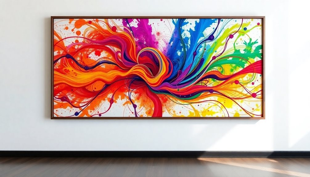
If you've ever thought of your running data as mere numbers, think again—one innovative runner is turning that information into stunning visual art. By transforming their training data, like distance and pace, into captivating pieces, this runner illustrates how data can transcend its quantitative nature. Using algorithms to map their running journey, they create patterns and designs that reflect both the physical and emotional experiences of their runs.
Imagine stepping into a gallery filled with vibrant visuals, each piece telling a story unique to the runner's experiences. These artworks don't just represent numbers; they encapsulate personal stories. Every curve and color represents a moment in time, a feeling, or a milestone achieved on the trail. This innovative approach to art highlights how data visualization can serve as a powerful form of creative expression. It invites viewers to connect with the essence of running, evoking emotions that resonate deeply with anyone who's ever laced up their shoes.
What's truly remarkable is how this runner's work has garnered attention from various museums. Their art isn't just hanging on walls; it's sparking conversations about the intersection of art, technology, and personal narrative. Museums are eager to showcase these data-driven pieces, recognizing the potential for art to engage audiences in a new way. By breaking down the barriers between numbers and aesthetics, this runner is redefining how we perceive both art and data.
Through this process, the artwork becomes more than just a visual feast; it serves as a reminder that even the most abstract numbers can tell profound stories. The training data, often seen as a tool for improvement, becomes a canvas that captures the essence of a runner's journey. Each piece stands as a testament to dedication, reflecting the hours spent training, the challenges faced, and the triumphs celebrated.
As you explore this innovative approach to visual art, you might find inspiration to consider your own data differently. Whether you're a runner or not, the idea that personal narratives can be expressed through data visualization opens up a world of possibilities. With each brushstroke, this runner invites you to appreciate the beauty in both art and the stories we all carry within us, waiting to be transformed into something visually stunning.
Conclusion
Turning your training data into wall art isn't just creative; it's a celebration of your journey as a runner. It transforms numbers into a visual story that resonates with both you and others. As museums recognize this unique blend of art and athleticism, you're reminded that every mile you run can inspire. So, why not showcase your achievements? Your training data could be the next piece of art that captivates hearts and sparks conversations.